
Did Grater Things Get a Facelift?
Share
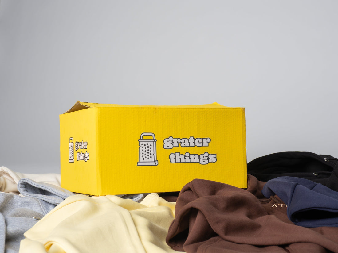
Grater Things has a whole new look. Why did you want to rebrand?
Aidan Turner (Founder): When I started it almost five years ago now, I really wanted to dive into the cartoony, playful look. The brand, in my opinion, didn't have enough character, and I wanted to lean more into the fun, colorful, playful aspect of it. So I wanted it to be more cartoony. I wanted it to be funnier. I wanted it to be happier and more playful like I said, so I wanted to give it a lot more color. I wanted to make, you know, rounded edges. I wanted to have it be a lot more illustrated. I mean, you can see that the text is kind of like chubby a little bit. It's very rounded, and it's a lot more fun. The old branding didn't really match, and the old font almost seemed like a historical kind of font. And the logo itself had really sharp edges, and it didn't give enough character. I wanted to give the brand more character and make the branding a lot stronger because it deserved to be a lot stronger, and it needed a lot more attention. And by giving it this, this redesign, this rebrand, we're achieving that.
What do you want people to see and take away from the rebrand?
Aidan Turner (Founder): I want people to see us as punny; cheesy. You know, almost cliche in an intentional way. I want people to feel comfortable. I want people to smile when they see the brand because that is at the essence why the brand was founded. We're all about having fun, enjoying the journey of life, and making the most of every moment. Doing that while you're happy, doing that while you're smiling. And we help out by making you comfy while you are experiencing these amazing things and these Grater Things in life.
What is your favorite thing about the new website?
Aidan Turner (Founder): My favorite thing about the new website is the product photos. There was a lot of thought put into every single detail of what the product photos look like, and seeing it come together is just fantastic. We did a lot of paying attention to how the garment was laid out. You know, there are wrinkles, it's imperfect. It looks like it was just kind of thrown there. There's a lot of shadows, but that's what we wanted. We wanted it to have a lot more character. This like, clean, crisp look just didn't blend well, and it wasn't under this new branding. Everything needs to be consistent. Everything needs to talk to each other. And you need to be able to see one of our product photos somewhere out there and say, “Oh, wow, I know that's a Grater Things.” It's kind of organic. You're just laying it there, and by giving it a colorful background, it makes the garment pop even more. But when you put all these tiles together, you see all the products together. There's so much color and there's so much going on, but there's a cohesion, in a way. It's a lot more fun, it's a lot more playful, and it's a more exciting shopping experience. Whereas, you know, a lot of brands will just do a white background or a black background so that you can emphasize the product. Our products are colorful. We want you to get that experience. We want you to have an enjoyable shopping experience that's different from all of these brands, where their experience is a little stale.
Written and edited by Bella Tabak (@bellatabak)